Celebrity makeup artist, Nathan Johnson (@nathanwalnut), is QC Makeup Academy’s Executive Makeup Artist and is based in New York City. This month, Nathan shares his thoughts and offers some tips on a few of the student showcase submissions we received from our talented students!
Your individual voice as an artist will develop over years of consistent practice. Experimenting with techniques and combinations of techniques will put you on a path of discovery that will shape (and reshape) your artistry.
As artists, we should always be learning and growing. We should always strive toward bettering ourselves and our work. This doesn’t just include our artistry, but also how it is presented. No matter how much we learn, there is always room to grow.
Therefore, today I would like to offer some praise and advice (on technique, images, presentation, etc.) to some of the QC students who have been putting in the effort and shaping their craft. Please know, in reading this feedback, that I chose each example because it shows skill, but also has room for growth.
When you are able to teach yourself to look and critique at the detail in your work, you will become your own teacher. I hope that after reading this critique, you’ll be one step closer to becoming the great makeup artist you’re striving to be.
 If the silver was meant to be the highlight shade, make sure the crease color is visible through the crease and at the outer corner of the eye.
I want to draw attention to the brow. In classic application, a brow should have only one angle, the arch. At the inner eye, the brow should slowly rise to just past the pupil (or the iris, depending on the eye), and then begin its descent—two lines connected by one angle.
You’ll notice in this application there are two angles—one 1/2” in from the start of the brow after which the brow begins to angle down, and then another angle past where the arch would normally be after which it angles even more downward. This gives brow a very heavy, downward pull. I would recommend you practice the classic shape, and I think you’ll be dazzled by how much it lifts the face, expression, and features.
The last note I will offer is on the blush. Be careful about using blush for contour. All too often, people pull it too low which pulls the face down. Take a piece of paper and line the edge up right between the lip and the nose. See how much the face lifts when you cut off that lower inch of the blush? This is beautiful work, I am only offering a few tips to propel your progress.
If the silver was meant to be the highlight shade, make sure the crease color is visible through the crease and at the outer corner of the eye.
I want to draw attention to the brow. In classic application, a brow should have only one angle, the arch. At the inner eye, the brow should slowly rise to just past the pupil (or the iris, depending on the eye), and then begin its descent—two lines connected by one angle.
You’ll notice in this application there are two angles—one 1/2” in from the start of the brow after which the brow begins to angle down, and then another angle past where the arch would normally be after which it angles even more downward. This gives brow a very heavy, downward pull. I would recommend you practice the classic shape, and I think you’ll be dazzled by how much it lifts the face, expression, and features.
The last note I will offer is on the blush. Be careful about using blush for contour. All too often, people pull it too low which pulls the face down. Take a piece of paper and line the edge up right between the lip and the nose. See how much the face lifts when you cut off that lower inch of the blush? This is beautiful work, I am only offering a few tips to propel your progress.
 It feels to me that there should be more bolts and more areas of connection than what has been done here. Now, I am all for individual artist’s interpretation, but if you put bolts on some highlighted areas, it creates an expectation in the image that the points of contact should all have bolts (e.g. on the shoulder points, the jaw hinge, etc).
Next time, I would encourage you to fully consider the details and push your imagination beyond redoing something that has been done hundreds of times before—in essentially the same way. It’s ok to reinvent and redo, but yours should either be unique and different, or 100 times better than the ones you are duplicating.
It feels to me that there should be more bolts and more areas of connection than what has been done here. Now, I am all for individual artist’s interpretation, but if you put bolts on some highlighted areas, it creates an expectation in the image that the points of contact should all have bolts (e.g. on the shoulder points, the jaw hinge, etc).
Next time, I would encourage you to fully consider the details and push your imagination beyond redoing something that has been done hundreds of times before—in essentially the same way. It’s ok to reinvent and redo, but yours should either be unique and different, or 100 times better than the ones you are duplicating.
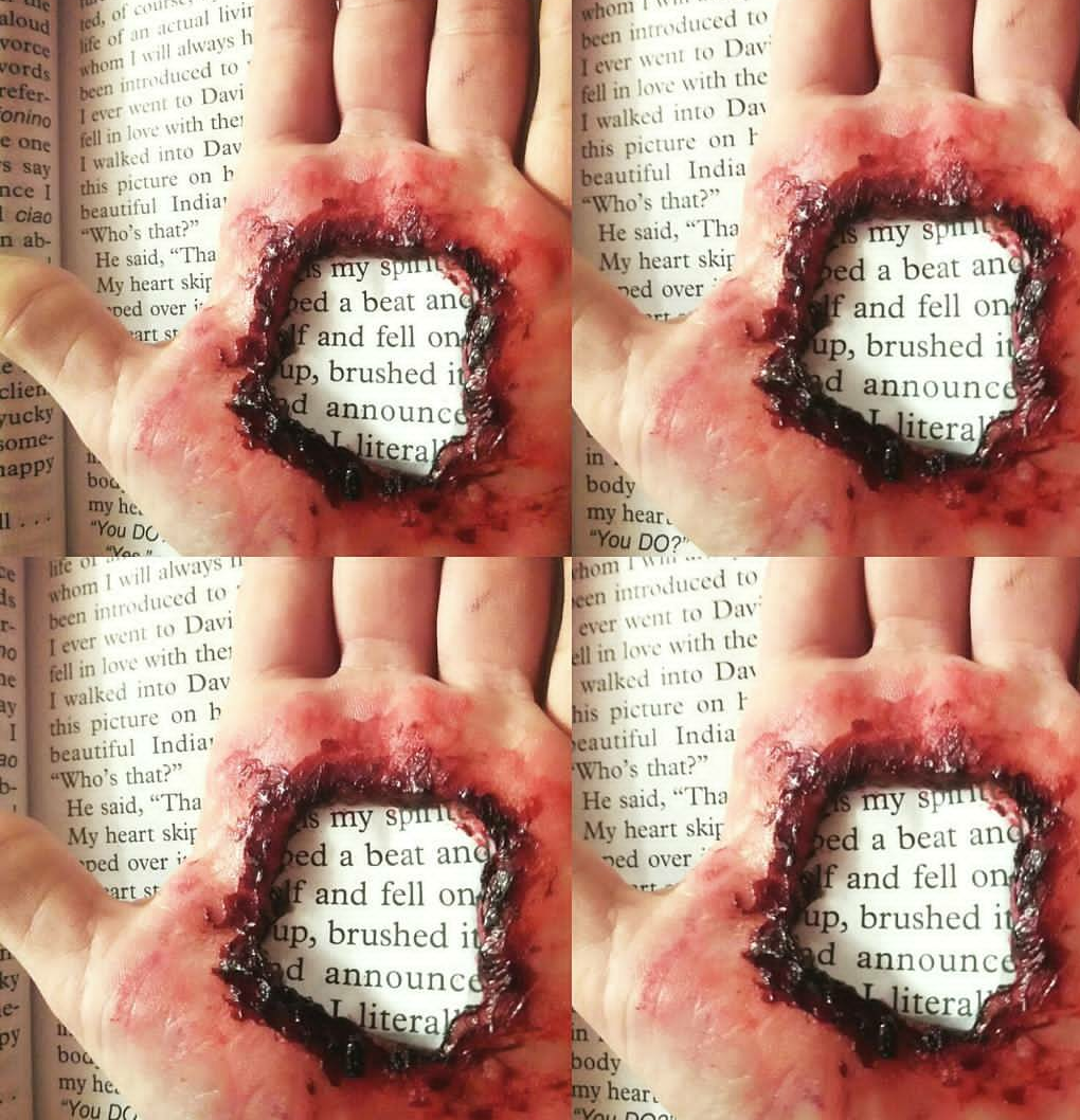 If there was a hole in the hand, the wording below it would be the same size on the rest of the page….how do you solve that? Make a photocopy of the page and just minimize the lettering until it looks the same size from the raised up perspective.
Secondly, remember that a hole of this magnitude would have depth (it pierced the hand after all)! So building the wound crater a little higher will allow you to put some black on the inside edges of the wound, and even some on the inner part of the flat of the hand. This will send the eyes into the wound, giving the amazing illusion of depth.
This is stunning work, and a few small adjustments would send it over a top!
If there was a hole in the hand, the wording below it would be the same size on the rest of the page….how do you solve that? Make a photocopy of the page and just minimize the lettering until it looks the same size from the raised up perspective.
Secondly, remember that a hole of this magnitude would have depth (it pierced the hand after all)! So building the wound crater a little higher will allow you to put some black on the inside edges of the wound, and even some on the inner part of the flat of the hand. This will send the eyes into the wound, giving the amazing illusion of depth.
This is stunning work, and a few small adjustments would send it over a top!
 I would encourage you to soften your highlight and contour. Looking at the image, you can see the full 1.5” line of contour along the forehead and under the cheekbone. You can see the highlight building up the mask of the face and the extreme strobe down the nose. If you soften these a little, they will look more natural—more like skin and less like heavy makeup. The techniques are correct, I am just encouraging you to explore using a lighter hand. Remember, most people want you to see them, not the makeup.
Second, I want to point out the brows. Yes, they are shaped beautifully and follow all the current Instagram trend guidelines. But because of the aggressive shape and color, they are also the main focal point of the whole face. Do you want people to look to the eyes or the eyebrows? Right now, the first thing you see is the brows, second, the nose, third, the eyes. Normally, the desired focal point is the eyes or lips, with the rest of the features complementing, not overshadowing the look.
Lastly, I want to take a closer look at the eye makeup. The photo right eye is shaped and applied beautifully. The colors blend in a magical way and the application really highlights and lifts the eye. However, the photo left eye is a bit asymmetrical. First, there is far less inner corner highlight; and second, the crease shade is applied more heavily handed, less blended, and the very outer corner of the eye is a different shape and angle. Doing symmetrical makeup is very hard, so I want to challenge you to take strides in that direction.
I also want to encourage you to find your voice in the world of makeup and shy away from copying the YouTube and Instagram guru’s. Remember, they do work to get followers and video likes—you’re doing work to be a makeup artist who works in the real world on real faces.
Your work is excellent, just find yourself (and your client base) in it!
I would encourage you to soften your highlight and contour. Looking at the image, you can see the full 1.5” line of contour along the forehead and under the cheekbone. You can see the highlight building up the mask of the face and the extreme strobe down the nose. If you soften these a little, they will look more natural—more like skin and less like heavy makeup. The techniques are correct, I am just encouraging you to explore using a lighter hand. Remember, most people want you to see them, not the makeup.
Second, I want to point out the brows. Yes, they are shaped beautifully and follow all the current Instagram trend guidelines. But because of the aggressive shape and color, they are also the main focal point of the whole face. Do you want people to look to the eyes or the eyebrows? Right now, the first thing you see is the brows, second, the nose, third, the eyes. Normally, the desired focal point is the eyes or lips, with the rest of the features complementing, not overshadowing the look.
Lastly, I want to take a closer look at the eye makeup. The photo right eye is shaped and applied beautifully. The colors blend in a magical way and the application really highlights and lifts the eye. However, the photo left eye is a bit asymmetrical. First, there is far less inner corner highlight; and second, the crease shade is applied more heavily handed, less blended, and the very outer corner of the eye is a different shape and angle. Doing symmetrical makeup is very hard, so I want to challenge you to take strides in that direction.
I also want to encourage you to find your voice in the world of makeup and shy away from copying the YouTube and Instagram guru’s. Remember, they do work to get followers and video likes—you’re doing work to be a makeup artist who works in the real world on real faces.
Your work is excellent, just find yourself (and your client base) in it!
 I notice in the vast majority of your submissions, your work shows only cropped sections of the face: a single eye, or worst of all—eyes closed.
Instagram is teaching young artists that closed eye images, and images that only shows sections of the face are acceptable to represent yourself as an artist. But they aren’t. If your goal is to get likes, and shoot towards an influencer status, follow that path. But if your goal is to work and earn money as a makeup artist, then you should look at reputable makeup agency websites and start to mold your image choices in that direction.
Clients are not likely to hire someone who has a ton of cut out eye and lip images. But they will very likely hire someone who has a whole series of images of people looking amazing and happy in their makeup.
In this image, I cannot help but notice the disparity in the lip application between the closeup and the 1/2 face. I see differences in tonality of color, but I also notice that the lips are a completely different shape (one is fuller—perhaps overdrawn—and the other is thinner). Be careful about mixing work from different faces/applications. When keen eyed clients notice, it can make them wonder if the work is yours, or if it is retouched.
Great work! I’m looking forward to seeing more of your work and student showcase submissions.
I notice in the vast majority of your submissions, your work shows only cropped sections of the face: a single eye, or worst of all—eyes closed.
Instagram is teaching young artists that closed eye images, and images that only shows sections of the face are acceptable to represent yourself as an artist. But they aren’t. If your goal is to get likes, and shoot towards an influencer status, follow that path. But if your goal is to work and earn money as a makeup artist, then you should look at reputable makeup agency websites and start to mold your image choices in that direction.
Clients are not likely to hire someone who has a ton of cut out eye and lip images. But they will very likely hire someone who has a whole series of images of people looking amazing and happy in their makeup.
In this image, I cannot help but notice the disparity in the lip application between the closeup and the 1/2 face. I see differences in tonality of color, but I also notice that the lips are a completely different shape (one is fuller—perhaps overdrawn—and the other is thinner). Be careful about mixing work from different faces/applications. When keen eyed clients notice, it can make them wonder if the work is yours, or if it is retouched.
Great work! I’m looking forward to seeing more of your work and student showcase submissions.
I want to congratulate all of the people who were featured in this article. Because they are practicing and putting in an effort to grow, I am able to offer them micro adjustments to improve their artistry. I hope you will all learn from their example and apply dedicated practice to your artistry. Sometimes, mistakes are the fastest path to growth.
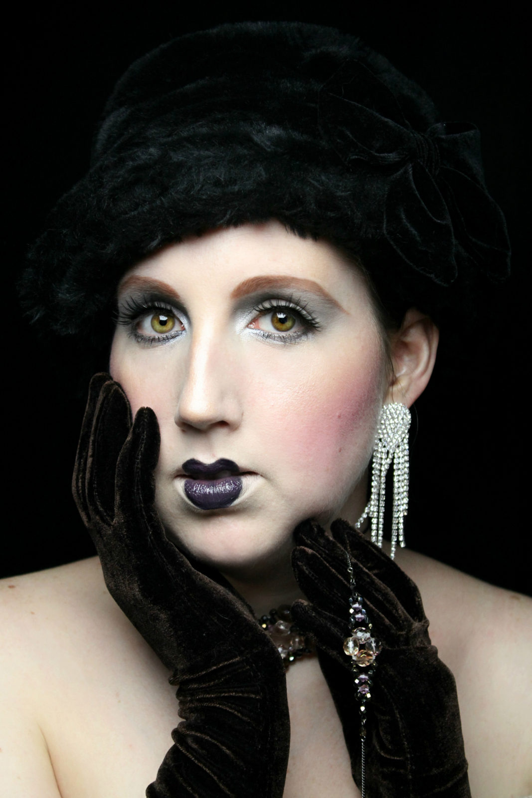
Vanessa Pressacco
I am a longtime fan of Vanessa’s. Not only is she a dedicated and hard worker in the world of makeup, she is also a talented photographer and creator of her own successful brand of makeup— War Baby.
This image is fascinating. It combines both elements of classic application and period elements. First, the photography and styling are fantastic.
I find the makeup look to be interesting. The skin is beautiful and crisp, and the eye shadow is very appropriate to the feel of the image. However, bringing a colored shadow all the way to the brow can go a little 1980’s if you aren’t careful.
That being said, the muted color palette all the way to the brow gives the image a feeling of having been a hand-painted negative.
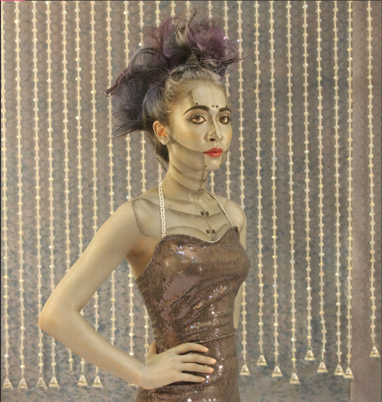
Laylah Quirin
I find this look, both the image and concept, to be very engaging. Although this look has been done before and there are no major reinventions here, it is done very well!
The highlight and shadow work really bring the image to life. I also want to commend you on your commitment to the character and the image. Usually people only do the face and half of the neck, and your willingness to do the entire visible body really shows dedication and attention to detail.
Speaking of detail, I would like to see the bolts carry through the look.
Danielle Hicks
When it comes to makeup artistry, the magic is in the details. First, I want to commend you on your imagination. Your work is conceptual, detailed, and in some cases… ghastly! I chose to talk about the pierced hand because aside from a few small elements, it is perfect.
The wound and the coloration are excellent. You have uneven bruising and wound pattern, which is very realistic. The color and color placements are also spot on.
Here are my two recommendations. First, commit to the illusion.
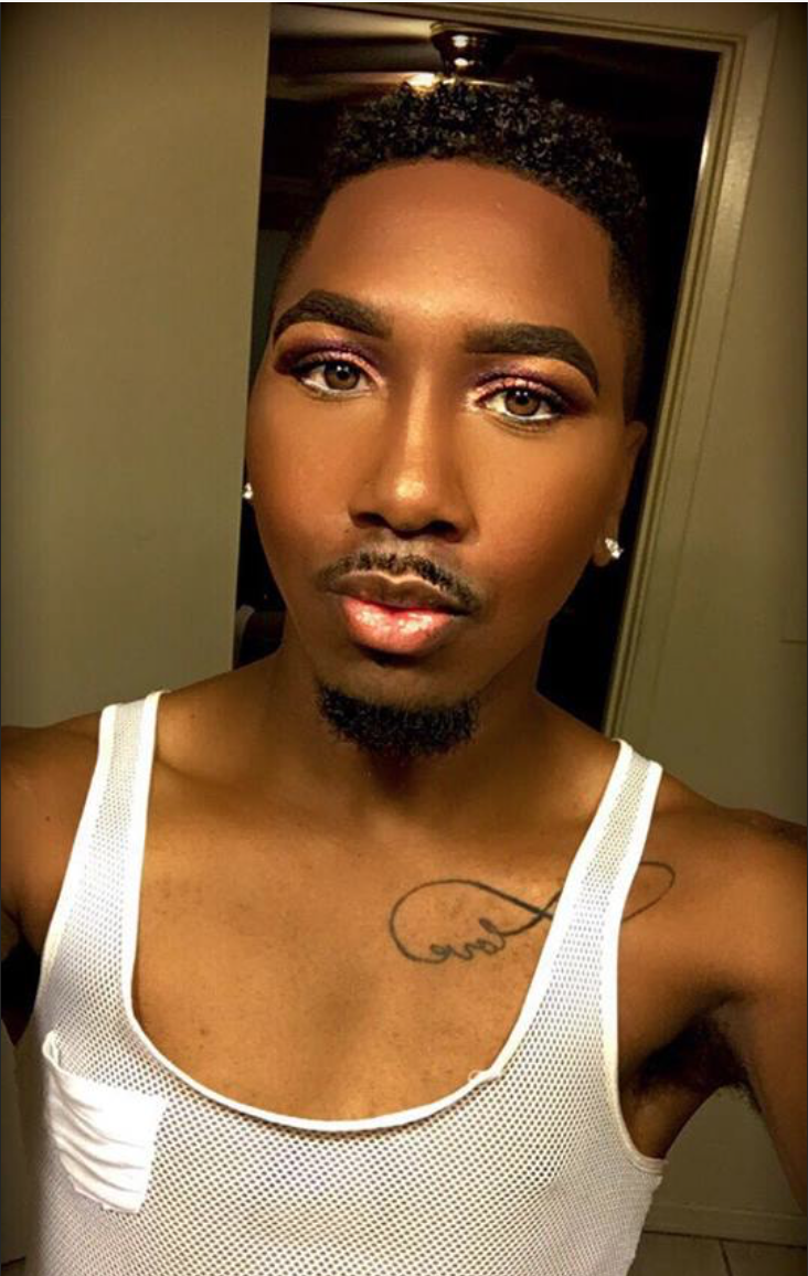
James Garner
Your skill with foundation, blush, highlight, and contour are undeniable. You definitely know how to build a flawless full coverage face!
That being said, there are a few points I want to draw your attention to. The influences of Instagram and YouTube can be deep. It is important to remember that what is done on these platforms is not often done in the real world (aside from a few clients who like these makeup looks). When one becomes entrenched in the Instagram and YouTube world, they develop what I call “makeup blindness”.
Because they start to see so many heavy or overly done applications, they start to think it’s how make up is done. But if you pay attention, you’ll notice that 99% of the time, makeup isn’t done that way.
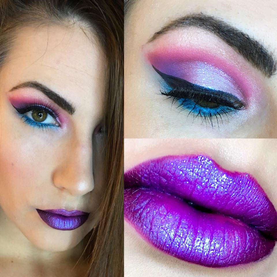
Sophie Kraynak
It is undeniable that the application on the eye and lip is lovely. The color combination is young and fresh, and it is very flattering. I appreciate the effortless transition of one shade to the next on the upper lid. The blending is beautiful as well, and it pairs perfectly with the sharp cat eye.
Normally I do not critique anything that doesn’t show the full face (i.e. both eyes) because it is very easy to do makeup on one side, but it is harder to match it with symmetry on the other.
I want to congratulate all of the people who were featured in this article. Because they are practicing and putting in an effort to grow, I am able to offer them micro adjustments to improve their artistry. I hope you will all learn from their example and apply dedicated practice to your artistry. Sometimes, mistakes are the fastest path to growth.