
As a new makeup artist, you’ll quickly find that online tools like social networking profiles and websites are extremely useful for advertising your services and building your client base. In fact, in our current society, they’re basically essential! Particularly for those who aren’t familiar with the different online capabilities that might be used to network a business, the prospect of building professional pages can be daunting. Developing your own website is especially challenging because the process of building one isn’t as cut and dry as setting up a Facebook page, for example. As a result, many businesses and free lance makeup artists make some common mistakes, particularly if they’re using web building tools for the first time. If you’d like to build a terrible website for your makeup services, here are some great ways to achieve your goal!
1. Place your navigation tools wherever you’d like
Popular websites usually place their navigation tools horizontally near the top of the page, or vertically down the left side. These spots are generally at eye-level, making them easy to find for the user and allowing for simple clicking between information pages. Terrible websites, however, tend to avoid these intuitive places. Instead, users will have to locate main navigation bars near the bottom, in the middle, or down the right side. The more uncommon the place, the harder time your visitors will have finding the various pages of your site.

2. Don’t tell people where to find things
On most web pages, the menu names in the navigation bar are very descriptive. Each one tells visitors exactly what they’ll find on that page, allowing them to easily locate the information they’re looking for. The headings are simple and to the point, but detailed enough to ensure that users can find what they need on the website. On a terrible website, however, the menu headings will be vague. The more generic that the menu items are, the more pages visitors have to click on before they actually find the information they’re looking for.
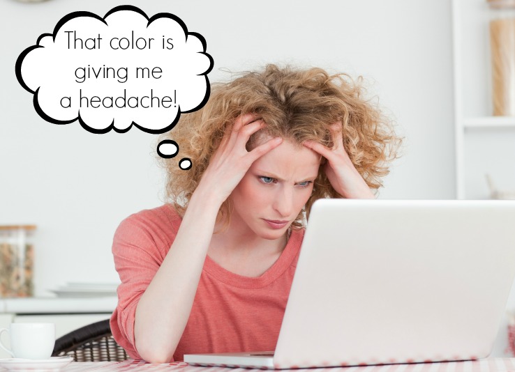
3. Think bright and crowded!
Most user-friendly websites include enough color to be visually pleasing, but not so much that it becomes overwhelming and users have trouble reading the words. Similarly, good sites usually avoid crowding too much information or too many pictures into one place. A terrible website, however, might use extremely bright color combinations, like yellow writing on a hot pink background. Additionally, many pictures and chunks of information are often crowded together in small spaces. The busier the page is, the longer it will take users to find the links and information that they came to the page for.
4. Sequence isn’t crucial
Most effective websites format their posts so that the newest information appears on the page first. This ensures that the most recent updates are easily accessible to users seeking information about the business and their services. Rather than organizing new posts in this manner, terrible websites often display updates with the oldest posts showing first and the newest ones situated pages into the site. Some terrible websites even go so far as to post updates in a random order, increasing the amount of time users must spend searching for the most recent information.
5. Hide your brand
When a user clicks on a good website, one of the first things they expect to see is the logo of the business or brand whose page they’re visiting. Most sites will feature this on each page, usually in a place that is clearly visible but doesn’t distract them from important information. Seeing a clear logo shows the user that the business is legitimate and gives them a point of reference if they want to visit the page again. On a terrible website, however, the brand or logo is often hidden in a much subtler spot. Users will have to search much harder for the name of the business in order to reference it again.
6. Advertise away!
Advertising on websites is very common, even on high quality pages. Some websites offer advertising space on their page to different companies as an additional revenue stream, while some simply use that space as an additional spot to promote their own sales and services. There are many different types of advertising, but most good sites stick to ones that are subtle enough to get the message across without annoying the visitor so much that they leave the page. On a terrible website, however, more aggressive forms of advertising, such as popup windows, are often used. This will interrupt your visitors while they browse for information.
7. Forget about it!
High quality websites with effective features and up-to-date information take regular maintenance. Either the business owner or a web professional will check the site regularly to ensure that all links and buttons are working and to keep contact information and commonly browsed materials current and updated. Makeup artists running terrible websites, however, will often build a website and then let it be. In this situation, visitors might have trouble getting in contact with the business or artist if the contact information expires, or experience issues accessing links that have changed since the page was built.
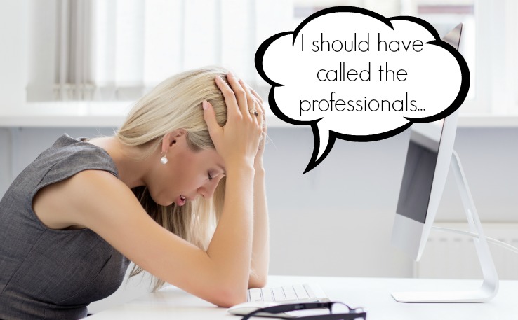
8. Who needs professional advice?
Cosmetic businesses and freelance artists who are having trouble with independent website builders often hire the help of professional web designers. This way, visitors are afforded a higher quality and more user-friendly experience than what the artist might be able to create themselves. Other business owners hire a professional to walk them through the process of building their own page so that they can learn the process, rather than having someone do it for them entirely. Artists who develop terrible websites, however, often avoid professional help when they might actually need it. Instead, they might leave the site partially finished or unclear, forcing visitors to try navigating their formatting attempts.
Don’t develop a terrible website!
As you might have noticed, terribly built websites are inconvenient for potential clients trying to visit your page. Sites that are badly formatted, crowded or unclear, and poorly thought out don’t benefit your business in the ways that online tools should. The point of highlighting tactics for creating a terrible website is to show you all the ways in which makeup artists who build their site in these ineffective ways might actually discourage people from seeking out their services. Keep these bad habits in mind while you develop your own website, and avoid falling into these common traps!