See the finalists for the Trick category of QC’s Halloween Makeup Contest!

See the finalists for the Trick category of QC’s Halloween Makeup Contest!
See the finalists for the Treat category of QC’s Halloween Makeup Contest!
It’s time to announce the winners of our 2018 Mermaid Makeup Contest!

See the finalists for the Deep Sea category of QC’s Mermaid Makeup Contest!
See the finalists for the Sparkling Surface category of QC’s Mermaid Makeup Contest!
It’s time to announce the winners of our Merry Little Elf Holiday Makeup Contest!
But first, we would like to extend a huge “THANK YOU” to all our participants, the semi-finalists, finalists, and our judge!
This year, our fabulous judge, Nathan Johnson, created a personalized scorecard for each finalist to determine the winner.
There is no better way to spread holiday cheer than with a winter makeover, except when that winter makeover has an ELFIN theme! This years holiday contest is tailor-made to stretch your imagination and challenge your skills.
What is a holiday elf to you? For some it will involve realism and complex prosthetics, for others it will be more artistic-perhaps more of a cartoon or pop art interpretation. As long as you have fun, there is no right or wrong.
Here’s what Nathan was looking for:
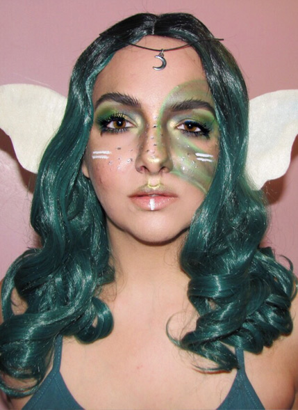
Artist: Amanda Westgard
Comments: I do appreciate the uniqueness of this application. Of all the submissions, it is by far, the most out of the box and purely of your imagination. The camouflage, the tribal lines, and the amulet, all tell a very bold story that makes the imagination run wild. But there were two things missing for me. Equal weight was given to all 5 categories. Instead of writing the story of your character, you simply named her.
Had challenged your imagination for a few sentences of story, that would have garnered full points from that section, instead, that accounts for the loss of most of your points. Second, is the combination of skills. Your ability with detail (the brows, the spots on the nose, etc) is superb. It shows you are a great artist. But, if you had considered using more skills—either prosthetics or highlight/contour to reshape the face, for example—your look would have been over the top perfection. You did great work. In the future, really challenge yourself and don’t forget the story!
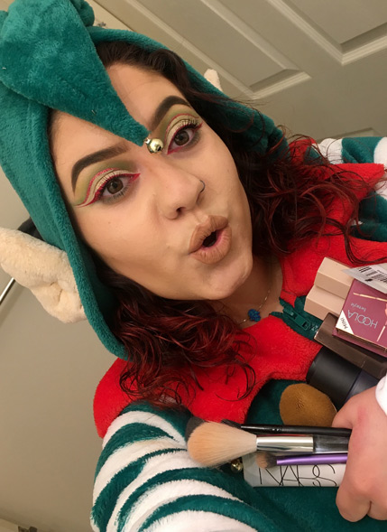
Artist: Monique Lovecchio
Comments: I appreciate your take on bringing to life a shelf elf who is makeup obsessed. It is a very creative concept.The makeup application is lovely. It combines many beauty techniques. There are two things I want to point out. Green and red/pink must be used very carefully on the face for several reasons. First, people can get a greenish or yellow hue if they are ill.
Second, when reds/pinks are used improperly around they eye people can look like they are sick or have been crying. I think you have done lovely work above the eye, but I want to take a look at the inner corner and the lower lash line. The red inner corner is evoking images from many a horror movie where someone becomes infected with some deadly strain and the inner part of their eye goes red. Combine this with the green below the lash line and it almost has an unintended sinister or ill feeling. when you add in the nude/ colorless lip and lack of blush, the feeling of un-wellness carries through a bit more. She is an elf and she loves makeup, right? Some color in the lips and color in the cheeks would have made her far more jolly, AND they would have gone a long way to counter the red inner corner and green below the lash line. It is very in trend to do cut creases, nude lips, overly shaped brows, and minimal blush, but leaving some—or all— of them out might be more appropriate to the character you are creating. Additionally, the only thing that makes this an elf, and not a makeup using holiday colors is the hat. I would encourage you to consider a few other techniques to finalize the look. My main take away for you—you have a lot of skill and you’re a great story teller. I would just reconsider some application techniques/ color placement and knowing when trend makeup helps or hurts a character. Great job.
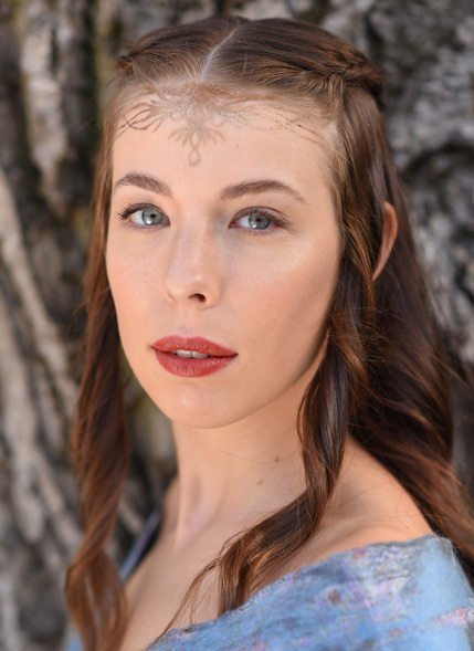
Artist: Adela Simpalean
Comments: This is a lovely makeup and it is very true to an existing character. I have a tremendous amount of respect for that. As a whole, the application is nearly flawless. The skin, lips, and cheeks are perfect. The eyes have just enough detail to make them the focus. The details on the forehead are lovely, not fully symmetrycal, but that can easily be overlooked. I commend you on doing a beautiful makeup and making sure the image continued to tell the story. The one thing that would have sent you over the edge would have been the use of some more skills. For example, if you’d added an elf ear of some sort. Congratulations.
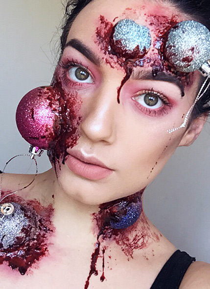
Artist: Jessica Shay
Comments:I have to admit, there is nothing original about this concept. There are a ton of online how to’s teaching people how to put broken ornaments on the face. That being said, you did it beautifully. You actually did it better than most of the people teaching the how-to’s. With the application, you hit two sides of makeup very well. With the use of ornaments, their adhesives, and the complimentary wounds and bruising, you demonstrated a wonderful, horrible, and realistic, use of prosthetic work.
Also, the beauty makeup you did is precise and gorgeous. BUT, I do have to ask, if someone was in this big of a fight, would their eye makeup still be this perfect? probably not. Thank you for the story as well. I will make one last confession. If it wasn’t for your story, no one would ever guess this is an elf. It looks like a woman who got into a nasty situation at Christmas Town Shopping Center. The use of an elf ear, would have taken this to a whole new level (as possibly would have a beauty makeup that reflected her trauma, even in a small way). Again, the work you did is superb. In the future, I want you to innovate beyond what everyone has already done. Just because you can do it better, doesn’t mean it’s innovative. This is excellent work, next time show me your imagination.
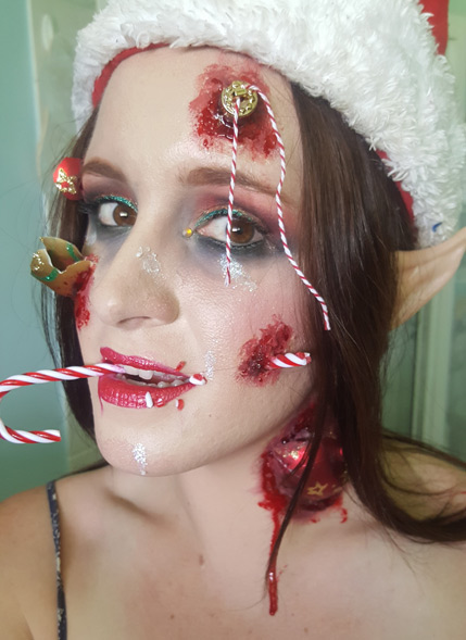
Artist: Cara Sawtell
Comments: I find both the story and the makeup fascinating. I want to give you great kudos for fully committing to the story you are telling and for using a great combination of techniques to make it happen. Yes, this is a makeup challenge, but sometimes, it is the lack of perfection that best tells the story. The skin and lips are perfect, except where you don’t want them to be.
I love that you used the broken ornaments in a variety of ways, shapes and sizes. The candy cane through the mouth is a great effect and it sells your story. Remember, if a candy cane pierced the cheek the would would likely not be so huge, consider a smaller wound and more bruising. Like I said earlier, you have not done anything with the candy canes or the ornaments that has not been done before, many times, but you did fully commit to a story. What really sells this is the fact that you can tell her makeup was precise and beautiful before she got into her sugar related debacle. The smudged eye makeup, combined with the other techniques you used really make the image click perfectly with your story. Also, you used an elf ear. It is definitely not the most realistic, but it really goes far to add a final detail to your look. You did a lovely job. It is your combination of skills, willingness to tell a story, attention to detail, and presenting an image that truly corroborates the story that set you apart. Great Job.
Final notes from Nathan: I want to send out my congratulations to all of the amazing artists who participated. Each of you has the makings of a winner, but I did have to make the final decision based on the 5 guidelines that were laid out in the beginning. I am so proud of all of you and I look forward to seeing all the magic you make next time. Congratulations to all of you, but especially to our winner Cara Sawtell.
Cara wins a Tarte Limited-Edition Treasure Box, a Sephora “Fox in a box” sponge set, and a Too Faced “‘Tis the Season to Sparkle Glitter Set”.
The lucky winner of our student prize draw is QC Makeup Academy student Michele Clauser! Michele wins a Too Faced “Boss Lady Beauty Agenda”!
Thank you to all the artists who submitted entries for the contest! And to the 5 finalists, you should all be very proud of your work. Once again, congratulations Cara for winning the 2017 Merry Little Elf Holiday Makeup Contest!
It’s time to announce the winners of our 2017 Halloween Makeup Contest!
But first, we would like to extend a huge “THANK YOU” to all our participants, the semi-finalists, finalists, and our judges!
This year, our wonderful judges—Nathan Johnson and Azzi Williams—created personalized scorecards for each finalist to determine the winner of their category.
Click the links below to navigate to each category and view the judges’ choices:
The lucky winner of our student prize draw is QC Makeup Academy student Elektra Heart! Elektra wins an Anastasia Beverly Hills’ “Subculture Palette”, and two pairs of Stilazzi’s fantasy lashes.
Thank you to everyone who participated!
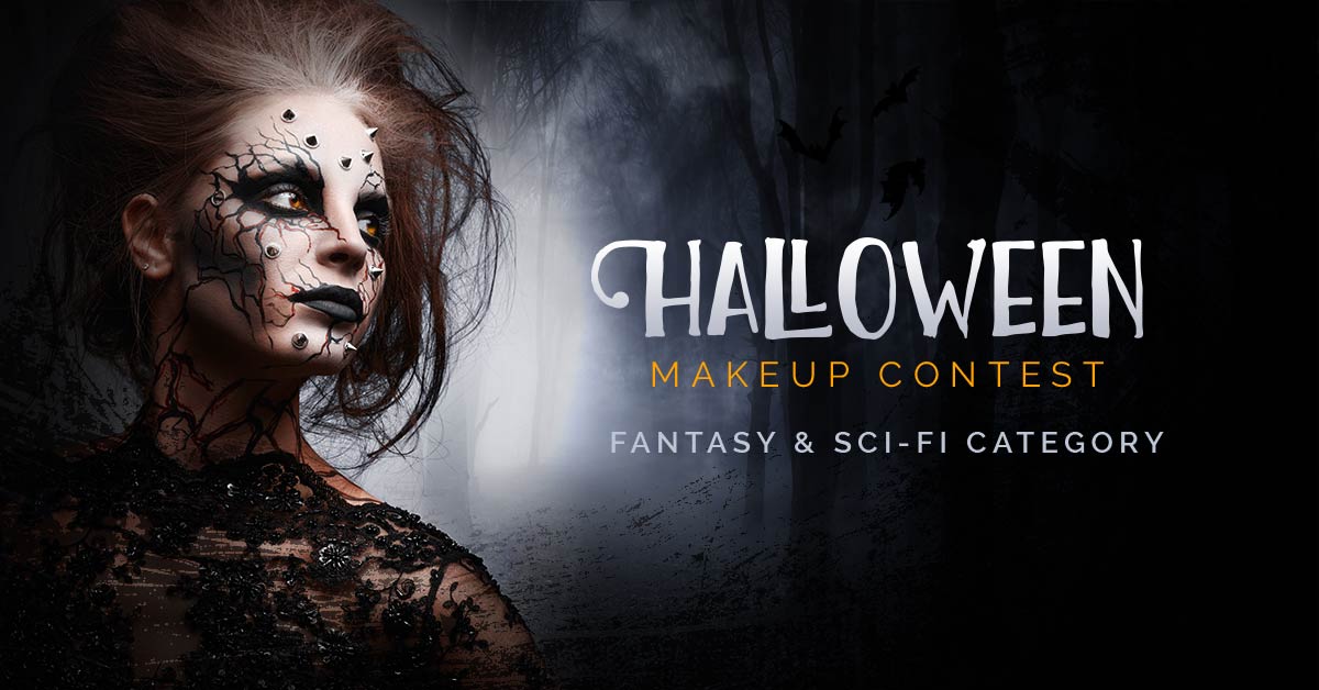
Here’s what Azzi was looking for:
Nothing blurred, out of focus or with poorly thought-out backgrounds (certainly no bedroom clutter in the background. And less is more with skin retouching and photoshop – and yes, I will be able to tell!
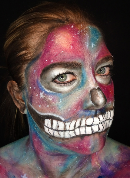
Artist: Ashley Sloan
Comments: Creative, intense pigments and incredibly artistic. Immense effort to create a truly unique look. Would have loved to see a little more intensity around the eye makeup to take the look to a more dramatic edge, perhaps with a false lash or shimmer for extra dimension. Also think about the hair when submitting a look – perhaps add a wig or style for extra effect.
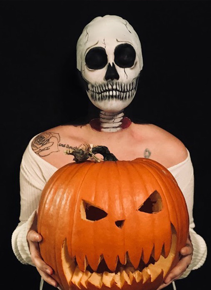
Artist: Brooke Forget
Comments:Intense, creative and haunting, beautiful recreation of a look that is currently a social media favourite amongst makeup lovers. Although it’s not a unique concept, it has been executed beautifully and shows tremendous skill and talent.
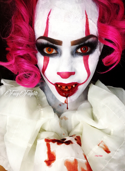
Artist: Heather Warner
Comments: A popular look this season with the launch of IT, this look is beautifully intense and photographs with energy and punch. While it is not a unique design concept, the pigment and application is bold and haunting.

Artist: Tyler Russell
Comments: A wonderful bold and creative effort. The neon intensity of the pigment used stands out and the artistic merit is incredible. Would have liked to see the hair come together with the makeup – perhaps a wig or a style that is consistent with this epic pop zombie look.
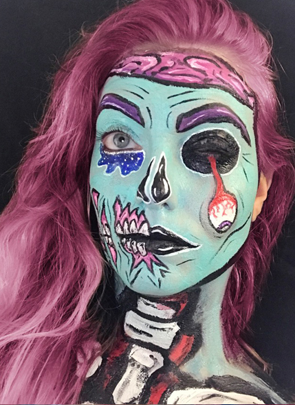
Artist: Brittany Bullers
Comments: The whole look is cohesive, fun, creative and vibrant. A pop-art take to a classic Halloween look. The black detailed work could be sharper and more defined, but otherwise a vibrant and energetic adaptation.
Brittany wins an Anastasia Beverly Hills’ “Lip Palette Vol. 1”, a RCMA’s “Shinto Palette”, and a Stilazzi’s artist caddy bag!
Thank you to all the artists who submitted entries for the contest! And to the 5 finalists, you should all be very proud of your work. Have a Happy Halloween everyone and once again, congratulations Brittany for winning the 2017 QC Halloween Contest, Fantasy & Sci-fi category!
Note from Nathan:
I want to extend a heartfelt congratulations to all who entered our Halloween makeup contest. I can say with certainty that these are among the best entries we have ever had. It was impossibly hard for the voters and the team at QC to narrow it down to a top 5. The winner was selected entirely by using the criteria that was listed at the outset of the competition. Remember, for the purpose of this contest, story is just as important as application. I would like to say it was too difficult for me to choose the winner on my own and I had to enlist the help of the team at QC. What some made up for in application, others made up for in story or other criteria, and all of those elements had equal weight in this contest.
Here’s what Nathan was looking for:
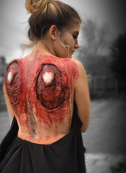
Artist: Charley Arnold
Comments: This is a stunning image. It is made even more impactful by the fact that you know the story before you even read the description. They say a picture is worth a thousand words, and in this case, the photography, model, artistry, and art direction all align to tell a powerful tale. The prosthetic use is lovely, the edges may not be perfectly blended, but the use of blood helps them to fade into the skin.
If I were to make two recommendations, they would be about the size of the wound and the use of blood. The holes in the back seem a bit too large for an area around a sawn off wing. I think the image might be a bit more powerful and realistic if the holes ended quite a bit closer to the “bone” of the wing and were a bit asymmetrical. Because the holes are so big, there would need to be far more blood running down the back, versus just being smeared to hide the prosthetic edges. To take your work a step further, I recommend practicing flawless edges for your prosthetics, even if they are self-made. Blood and bruising are tools to enhance a look, not to hide minor application weaknesses. I do want to commend you on the use of color. Your care with highlight and shadow in the wound gives it a beautiful dimension. As I said above, a picture is worth a thousand words, but I would have appreciated a bit more story. Who cut off her wings and why? The quote is good, but the story is lacking. Excellent work.
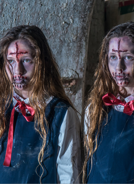
Artist: Elena Maraniello
Comments: This is a beautiful example of storytelling through imagery. Before I even read your description, it was clear to me that these were demon twins and that you were a filmmaker. But the rest of the story is lacking. Who are these demon twins? Where did they come from? What do they want? Even answering one of those questions would have satisfied the request for your characters’ story.
The makeup is really quite excellent. I appreciate the small details– the holes where the twine pierces the lip are perfect on the photo-right model. You created depth and incredible realism. If I were to offer some suggestions, I would say the bruising/darkness below the eye could be a bit closer to the eye. When you start to put color everywhere or pull it down too far, you can detract from the image. In this case, because there is a lighter area above the half moon of darkness, it makes it look a bit like a dark circle that was placed too low. Additionally, the edges of the cross on the forehead could be a touch smoother. If you used “Third Degree” makeup, it looks a bit like it might have dried before you could really perfect the edges. Again, the photo-right model has smoother edges than the photo-left model. These are just small micro-adjustments on a beautiful application.
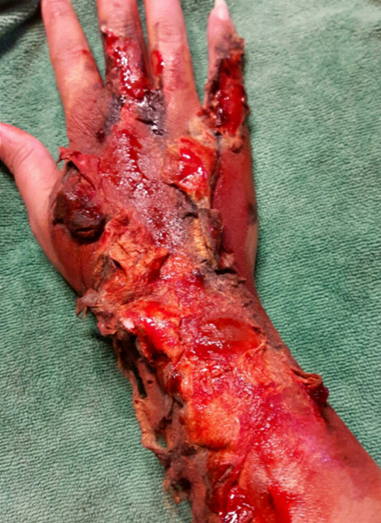
Artist: Jeimaliz Troche
Comments: For a first go, you have done some very compelling and graphic work. The roasted flesh peeling away from the arm is disgusting and in many places quite realistic. You would benefit a bit from the use of black. If someone was burned so bad that their flesh was literally hanging off, some of it would most certainly be charred.
There would also be a good amount of soot and smoke residue on the fingers and surrounding skin. The third and fourth degree burns are quite wonderful, I would just work a bit on the second and third degree. Instead of just putting a wash of maroon over the pinky edge of the hand (and on the fingers), use a gentler wash of red with a few blisters (maybe even some that have popped. This can easily be done with “third degree” silicone and latex). Then by letting the red fade gradually, you’ll have all the varying levels of a burn, and it will enhance the realism. The burn on the pinky itself is magnificent. This is beautiful work, and with a little bit more finesse, some picture quality, and a story, it could have been the winner. I cannot wait to see what you create for the next contest.
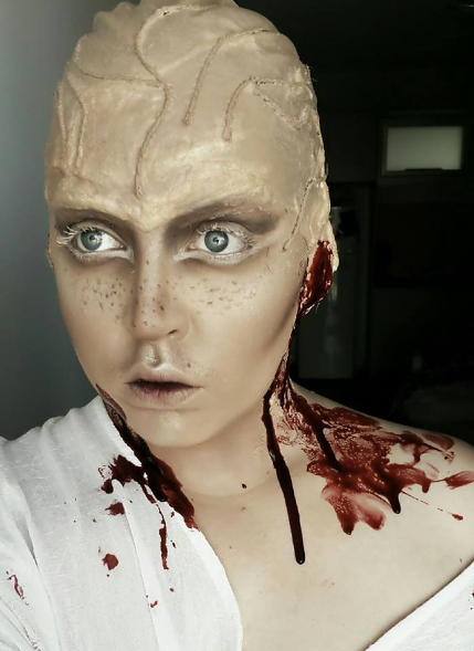
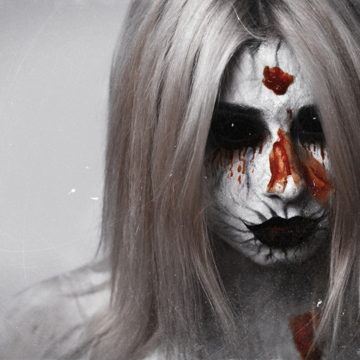
Artist: Tamikah Rivette
Comments: When it comes to originality, no one has you beat. You are also the only one who truly committed to a story. I want you to know how much I appreciate that. The complexion, the detailed work below and above the eye, the flesh tone eyelashes, and the freckles are absolute perfection. I am also crazy about the textured forehead. I’m not just speaking of the use of twine (for the veins?), but rather the texture of the head itself.
I wish some of this uneven texture, as well as the veins, reappeared elsewhere– perhaps on the shoulders, lower jaw, or chest. I can only find two minor things to point out. First, the area below and around the ear looks like it is peeling away, as do some of the veins. Secondly, a part of me would have appreciated it if there was a touch less blood. Sometimes when you create a very powerful image, a touch of editing will make it even more thrilling. A tiny trickle of blood running from her ear can be far more powerful than a bath of it. I learned from the QC team that you submitted this entry for the other category, and they rightly moved you to gore based on the amount of blood. I think this could have worked in either category, had you been a bit more restrained with your use of blood. Remember, our job as artists is to enhance a character, and allow its story to be told. When one is too aggressive on one element, it can overwhelm and detract from the rest of the look.
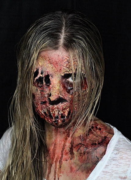
Artist: Halie Holley
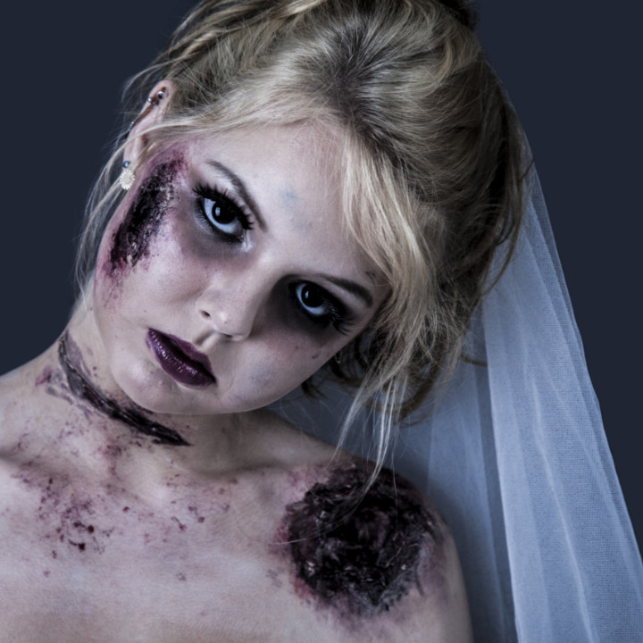
Comments: There is an old saying “the devil is in the details”, and I think you really took that to heart here. There are a lot to love here, but I think my favorite part of the makeup is the bite on the shoulder. It has depth, it is graphic, and in my imagination, it is likely where she first got bit causing her zombie transformation! I really love the texture and details on the face.
The scaled effect of the skin is innovative. You have completely distorted the features using a combination of techniques. And very impressively, all the edges are invisible. Yes, some may be hidden by the hair, but in the mask of the face, the application is flawless and that is where it matters the most. The rotting nose is glorious. The one thing that confuses me is why has the mouth sealed itself shut? Perhaps if you told me a bit of a story… for example, she was doused in battery acid by someone trying to escape her clutch, etc. Also, consider the blood. If someone has gone so far as to rot, they would most likely not have any relatively fresh blood below the eye. Blood flow is a sign of life or recent death. You could argue that that blood is from biting and consuming her victims, but I would counter by pointing out that her mouth is melted shut. The flawless application, diverse use of techniques, and the overall professionalism send this look to the top. For higher points, next time use your story to explain the application choices. Very impressive work. Beautiful image. Congratulations.
Thank you again to all who entered. It was a delight to see your beautiful work.
– Nathan
Halie wins a Ben Nye’s “Primary Creme Palette”, an Esum’s “Pro Palettes & Spatula”, a set of 5 latex prosthetics, two Graftobian creme foundations, liquid and gel blood, and a stipple sponge.
Have a Happy Halloween everyone and once again, congratulations Halie for winning the 2017 QC Halloween Contest, Gore category!
It’s time to announce the winners of our Fashion Week Makeup Contest!
But first, we would like to extend a huge “THANK YOU” to all our participants, the semi-finalists, finalists, and our judge!
This year, our fabulous judge, Nathan Johnson, created a personalized scorecard for each finalist to determine the winner.
Designing for the Runway is an AMAZING opportunity. This is a moment to create a look that will impact trends around the world for years to come. I want to congratulate everyone who participat-ed. There was a lot of amazing work here and it was very difficult to choose the finalists. I do want to let you know, that finalists were not chosen by popular vote alone (as Facebook can be a popu-larity contest based on number of followers, etc). My input was also used to choose these finalists, so have no fear about the fairness. And when it comes to the winner, it was chosen exclusively by me and my dear friend Ms. Leanne Marshall. And, not once, did we check to see how many likes any of the images received. I will be including some comments from her with some of the finalists. The decision for the winner was chosen entirely based on the criteria I listed and whether or not the look could actually be used at a Leanne Marshall NYFW show!
Here’s what Nathan was looking for:
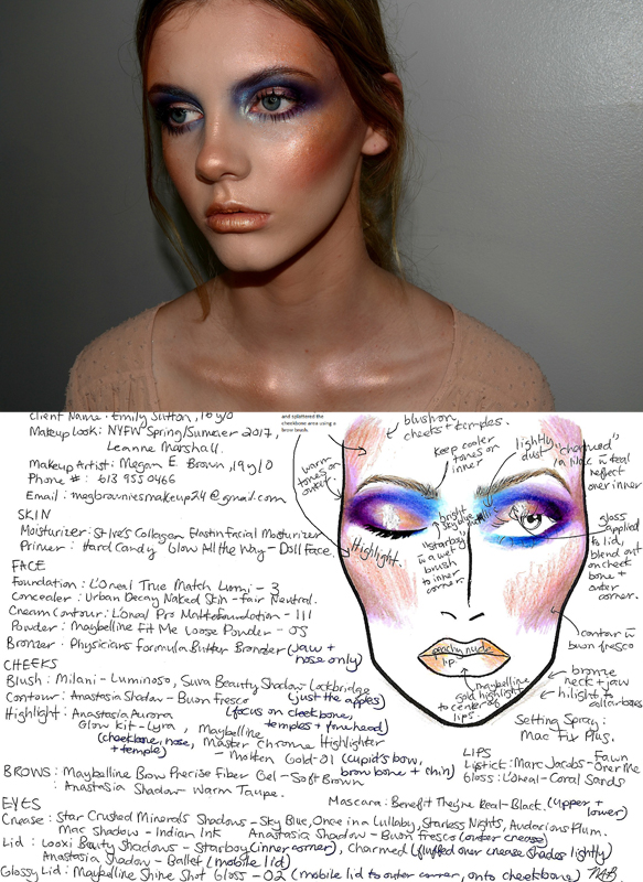
Artist: Megan Brown
Comments: In your description, you say that you want to play with shine and color to balance nicely with the elegance of the clothing and the designs. I think you created an interesting look, but it is more of an Instagram look than it is a NYFW look. As lovely as it is, this look would overpower the elegance and easy flow of Leanne’s designs. A big part of designing for a designer means doing research. Now, I did not tell you that Leanne does not like a strong cheek, but had you looked up any of her past collections, you would have immediately seen that. My advice would be to do as much re-search as possible. To your credit, I believe that you used strong application skills (The skin is gorgeous, the lip is precise), but it is just far too aggressive of a look to compliment one of Leanne’s collections (they are known for being delicate and ethereal). Had you taken down that cheek by 3/4, and gone a bit softer on the eye, we may be having a different conversation. Leanne felt that the eye and lip were too strong so she would not have picked this look to compliment her collection. The face chart is also done well from a color point of view, but the excessive writing would make it impossible to be used at a show. Simplicity is important….overall excellent work.
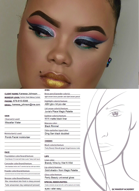
Artist: Karessa Johnson
Comments: I will start by sating this is an eye catching look. It is extremely precise and detailed. The look has near perfect symmetry, which is very difficult to achieve. The write up of your face chart is one of the best of all the submissions (clarity, simplicity, typed), but the illustration is not present. As I said earlier, a face chart is a road map for your team of artists, if you do not do one that is complete and correct, you are not preparing your team for success. You’ve created a lovely look, and I commend you on it, but I would also encourage you to do a bit more research into Leanne. You mention that “you kept the face soft”, this is actually a very heavy foundation application and Leanne is always less is more when it comes to skin. She likes her models to look ethereal, with softer, more natural skin. She also like focus to be in only one place. Leanne said, Karessa “has some skills on the eye! I love the eye. I just wish she would have left the lip minimal though.” This is a gorgeous make up application, but with the heavy foundation and the gilded lip, it is more appropriate for Instagram likes and followers than it is for the Leanne Marshall show. As I mentioned earlier, take the advice of Coco Chanel and take something off. This is beautiful work. Congratulations.
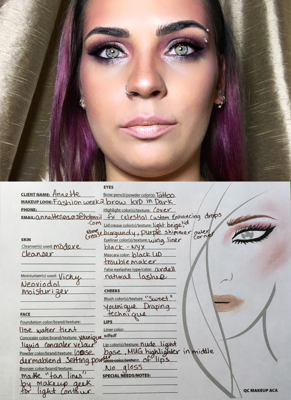
Artist: Annette Silvestre
Comments: I will start by saying that this is a beautifully applied look. But, it is also a look that has been done many, many times. If you look through Instagram or YouTube, you will find countless how to’s that the illustrate applications that look just like this (maybe using different colors, but the essence of the look would be the same). So, as lovely as it is, that makes it a bit forgettable. To make a look for the runway, it has to be novel. In a way, this seems like a recycle of what is currently popular on Instagram. I do not want to suggest that you didn’t do a beautiful job, I just want to see your voice as an artist, and a bit less of the heavy Instagram influence. You are very talented, and that is evident in the gorgeous skin, the symmetrical eyes, the nuanced lip, and the well-blended cheek. But, I want to start to see your voice as an artist shine through. You are more talented than most of the folks getting paid millions to do how to’s online…I want to see your true voice now, instead of versions of what is already out there. You are on the brink of greatness. Stop watching Instagram and YouTube, and allow your own imagination to inspire everything you do. With your talent, you can do anything you want…and I know you will, once you trust yourself. You are capable of extraordinary greatness…and I am ready to see you shine. As a note to the face chart, it does not truly represent the application, for example, the smoke on the bottom lashing is extreme in application, but not present in the chart. A face chart has to be precise because it is a road map for your team of 20+ artists.
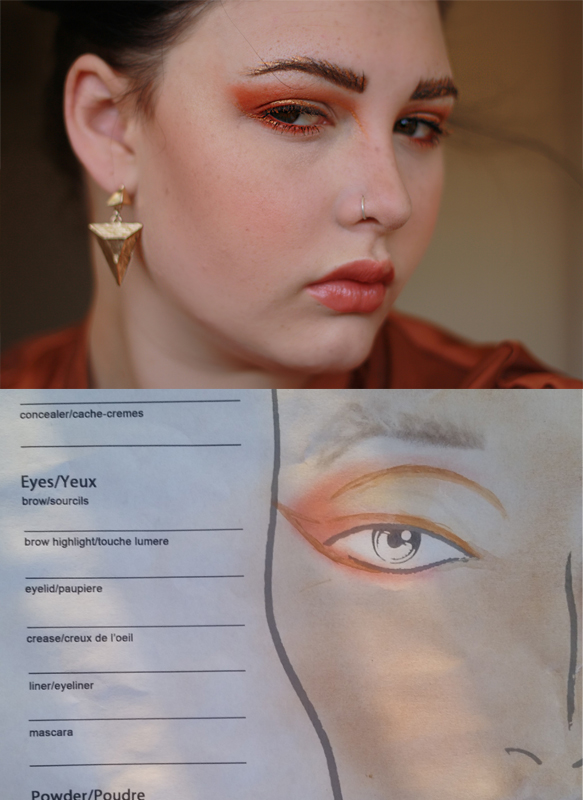
Artist: Deahnna Dunstan
Comments: Leanne said, that this look was her “favorite one at first glance. It’s a look I would choose for a col-lection.” And I have to agree. This look makes strong use of a collection color in an interesting and very high fashion way. A runway look needs to be strong, but quiet at the same time. Strong enough to make an impact, but quiet enough not to distract from the designs. You achieved that balance. BUT, the great Coco Chanel once said, “Before you leave the house, look in the mirror and take at least one thing off.” I think that would have served you very well in this instance. Brushing the eyebrows up was fine, not totally necessary given the strength of the eye, but putting a glitter orange powder below it took the high fashion look and added a level of cheapness to it. In the future, trust that what you did on the eye is enough. The lips and cheeks look great. Besides editing the brow, I would recommend more precision in the eye. In your chart, there are crisp, beautiful lines, and there is a very bright use of color on the lid. In your application that crispness gets lost a bit and the bright shade on the side is lost a bit. I think a bit less blending would have given you the crispness of the face chart, and the brighter pop on the lid would have made the look even more impactful. This is excellent work. But, a proper face chart is very important. By not filling out the product details, you would leave your team in the dark and that could cause a backstage disaster. With a touch more precision, the editing of the eyebrow, and a proper face chart, you very likely would have been the winner.
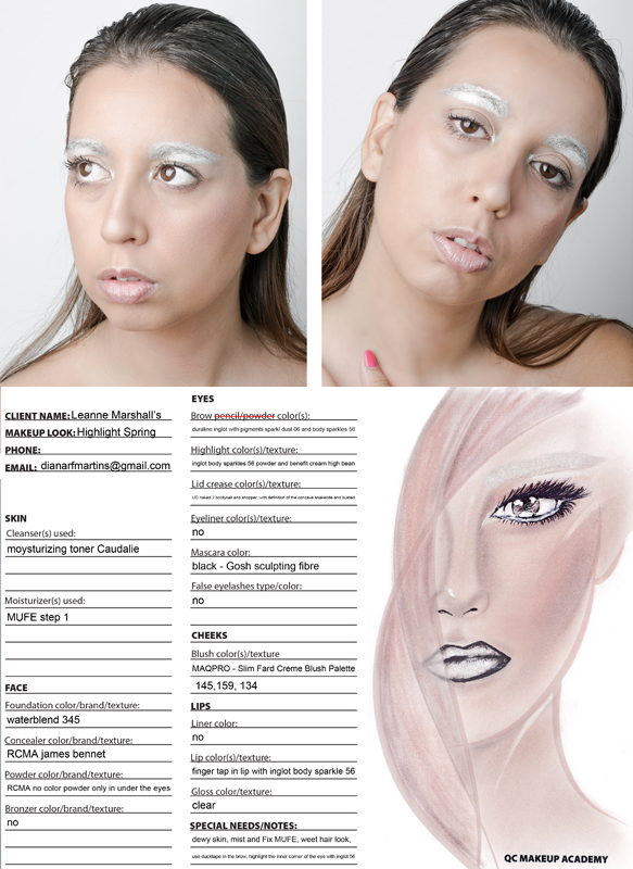
Artist: Diana Martins
Comments: This look is inventive and striking. Leanne said, this look “is original and I like that alien, high fashion look to it. Well Done.” And I totally agree. Choosing to keep the skin natural and fresh and put focus in only one unusual place, was a brilliant idea and it makes for a makeup that makes a statement while not taking away from the collection. This is what I would call a true compliment to a collection. I adore the dewy, perfect skin. And I just LOVE the use of stark color being primarily on the eyebrow. For this season’s collection that showed a week ago, the look I designed for Leanne put no color on the lid, it only used color on the brow bone! You are thinking outside the box, but doing it in a quiet way! Bravo! That is how you design for a designer. Congratulations. This is a very exciting look. As for the face chart. A face chart is not a painting. It needs to be very clear to show artists how to duplicate the look. Yours is very, very confusing with the skin fully colored in (remember models at a fashion show will be in all skin tones). The black lines around the lips are also confusing. Clarity is essential. The write up is clear and easy to follow, but the illustration makes it very difficult to follow as that will be their primary resource. Congratulations on some inventive and exciting work.
Final notes from Nathan: Creating a look for the runway has its own set of guidelines. You need to deeply research your designer, you need to make a statement without overshadowing their collection, and you have to create something that will inspire women around the globe to either be fascinated by it, or want to wear some version of it. Congratulations to all of you, but especially to our winner Diana Martins.
Diana wins a Cover FX’s “Illuminating Prime and Set Kit”, as well as Tarte’s “Tarteist™ Pro To Go Amazonian Clay Palette”.
Congratulations Deahnna for winning the 2017 Fashion Week Makeup Contest First Runner-Up Prize!
Deahnna wins a Urban Decay’s “UD Jean-Michel Basquiat Tenant Eyeshadow Palette”!
Congratulations Annette for winning the 2017 Fashion Week Makeup Contest Second Runner-Up Prize!
Annette wins a QC Makeup Academy’s Travel and Expandable Makeup Palette!
The lucky winner of our student prize draw is QC Makeup Academy student Inelda Santana! Inelda wins a Wander Beauty’s “Secret Escape Kit”!
Thank you to all the artists who submitted entries for the contest! And to the 5 finalists, you should all be very proud of your work. Once again, congratulations Diana for winning the 2017 Fashion Week Makeup Contest!